UI components / Cards
Bento Grid: a React and Tailwind UI component
An asymmetric feature grid whose tiles lift, glow and reveal a detail on hover.
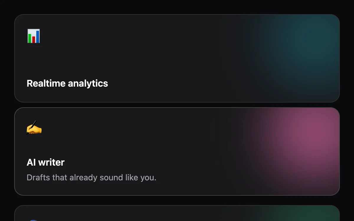
Open the live Bento Grid preview.
About cards components
Cards group a single idea: a product, a plan, a stat or a destination. Hover motion works best when it hints that the card is interactive and reveals one extra piece of information, not when it moves the whole layout.
Install the Bento Grid
- Create
components/ui/bento-grid.tsxin your React + Tailwind project. - Paste the code. It only imports React; keyframes are defined inside the file.
- Import the named component where you need it. The default export is a ready-made demo you can delete.
Frequently asked questions
Is the Bento Grid component free?
Anyone can open the live preview. Copying the code is included with a Scrollhaus plan.
What do I need to use it?
A React project with Tailwind CSS: Next.js, Vite, Lovable or Bolt. The file only imports React; its animations ship inside the component.
Is it accessible?
It uses native elements and ARIA attributes where needed, keeps keyboard focus visible and works without a mouse.
More cards
- Spotlight Card: A soft light follows the cursor across the card and lights up its border.
- Tilt Card: A 3D tilt toward the cursor with a moving glare; content floats above the surface.
- Product Card: Image zoom on hover, colour swatches that switch the product, and an add-to-cart that slides up.
- Stats Card: A KPI card with an animated sparkline that shows the value under the cursor.
- Flip Card: A card that turns over in 3D on hover or tap to reveal details on the back.
- Expandable Card: A compact card that grows smoothly to reveal more content.