UI Components · 2026-10-17 · 5 min read
21st.dev Alternative: Original React and Tailwind UI Components You Can Try Live
21st.dev made copy-paste React components feel normal: open a component, see it move, drop the code into a project. If you are searching for 21st dev, 21dev or 21stdev, you probably like that workflow already. This guide covers what to look for in an alternative and how Scrollhaus UI Components approach the same job.
Written by Amanjot Singh, founder of Scrollhaus, and edited by the Scrollhaus editorial team. Sources and methodology are documented in the article.
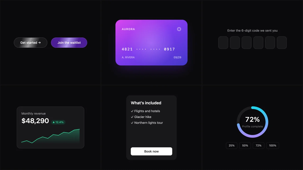
Quick answer: a good 21st.dev alternative gives you the same copy-paste speed with fewer moving parts: each component in one file, styled with Tailwind, no extra packages, and a live preview of the exact code you will paste. Scrollhaus has 49 original React and Tailwind components built that way, six of them free. Scrollhaus is independent and not affiliated with 21st.dev.
Why people look for a 21st.dev alternative
21st.dev is a large community registry, which is its strength: there is a component for almost everything. The same breadth is why people search for alternatives. Quality varies between authors, many components pull in their own dependencies (an animation library here, an icon set there), and a registry install can add files you did not expect. When you want one button that just works, a smaller curated set is often faster.
The other reason is how the code is used. More teams now paste components into AI builders such as Lovable, Bolt, v0 or Claude Code. Those tools do best with a single self-contained file. Every extra import is something the builder has to resolve, and a component that needs a provider or a config change can quietly break the page.
What to look for in a React component library
One file, no hidden dependencies
The simplest test is the import list. Our components only import React; motion is CSS keyframes or a few lines of state, and the keyframes live inside the component. You can paste the file and it renders, with no npm install step.
A live preview of the exact code
A screenshot or a video can hide a lot. Each Scrollhaus component preview compiles the same file you copy, in the browser, with React and Tailwind. If it works in the preview, it works in your project. Try the command palette, the hold-to-confirm button or the before/after slider to see what that means.
Accessible defaults
Keyboard support, focus rings and sensible ARIA attributes should not be optional extras. The sliding tabs use proper tab roles, the combobox search works with arrow keys and Enter, and the star rating is a real radio group.
Readable code you can change
Copy-paste only saves time if you can edit what you pasted. Each component keeps its settings at the top (colours, timing, sizes) and uses plain Tailwind classes, so restyling one is a find-and-replace rather than a refactor.
21st.dev vs Scrollhaus UI Components
| 21st.dev | Scrollhaus UI Components | |
|---|---|---|
| Source | Community registry, many authors | Original set, written and tested in-house |
| Size | Very large | 49 components, curated |
| Dependencies | Varies by component | React only |
| Install | CLI or copy | Copy one file |
| Preview | Per-component demo | Live compile of the exact file |
| Free | Many free components | Six free; a plan unlocks the rest |
Neither approach is wrong. If you want breadth and do not mind checking each author’s code, a registry is great. If you want a smaller set that behaves the same way every time, a curated library is easier. For a wider comparison that includes Magic UI, Aceternity UI and React Bits, see our side-by-side guide.
Free components to start with
- Shimmer Button: a call-to-action with a light sweep across it.
- Spotlight Card: a card whose border and surface light up under the cursor.
- Typewriter Text: headlines that type, pause and rewrite themselves.
- Testimonial Marquee: two rows of reviews scrolling in opposite directions.
- Confetti Button: a success button that bursts into confetti.
- Blur-In Text: words that sharpen into place one by one.
How to use a component in your project
- Open the component and try it in the live preview.
- Copy the code. It is a single
.tsxfile with a default demo export and a named component export. - Save it in your components folder, for example
components/ui/stats-card.tsx. - Import the named component and pass your own text, numbers or colours.
In an AI builder, paste the file and ask it to “add this component to the hero without changing its code”. Because there is nothing to install, the builder has nothing to guess.
Beyond components: full pages and 3D
Components are building blocks. When you need a whole animated landing page, the web templates are ready to paste into an AI builder, and the interactive 3D templates add cursor-driven three.js scenes such as the honeycomb field or the magnet orbs.
Frequently asked questions
Is Scrollhaus affiliated with 21st.dev?
No. Scrollhaus is an independent library. Its UI components are original code, written and tested in-house.
What is the best free 21st.dev alternative?
It depends on what you need. For single-file React and Tailwind components with no extra dependencies, Scrollhaus has six free components, and Magic UI, Aceternity UI and React Bits are also worth comparing.
Do these components need Framer Motion or other packages?
No. They only import React. Animations use CSS keyframes or a few lines of React state, so you can paste a file and it runs.
Can I use the components in Lovable, Bolt, v0 or Claude Code?
Yes. Each component is one self-contained .tsx file, which is the format AI builders handle most reliably.
People search for 21st dev, 21dev and 21stdev. Are they the same thing?
Yes. They are all spellings of 21st.dev, the community registry of React components. This guide covers alternatives to it.
Explore animated website templates at Scrollhaus →
Need help with a template, account, or project? Email admin@scrollhaus.ai.