UI components / Navigation
Sliding Tabs: a React and Tailwind UI component
A pill glides to the active tab, a hover highlight follows the cursor, panels cross-fade.
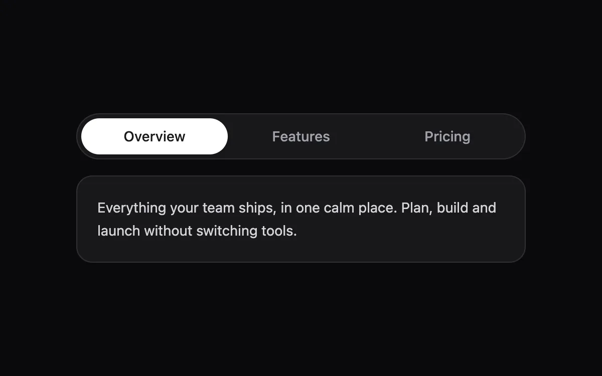
Open the live Sliding Tabs preview.
About navigation components
Navigation components need to be predictable above all. Motion should show where you are and where you are going, every item must be reachable by keyboard, and the current page should be marked with aria-current.
Install the Sliding Tabs
- Create
components/ui/sliding-tabs.tsxin your React + Tailwind project. - Paste the code. It only imports React; keyframes are defined inside the file.
- Import the named component where you need it. The default export is a ready-made demo you can delete.
Frequently asked questions
Is the Sliding Tabs component free?
Anyone can open the live preview. Copying the code is included with a Scrollhaus plan.
What do I need to use it?
A React project with Tailwind CSS: Next.js, Vite, Lovable or Bolt. The file only imports React; its animations ship inside the component.
Is it accessible?
It uses native elements and ARIA attributes where needed, keeps keyboard focus visible and works without a mouse.
More navigation
- Command Palette: ⌘K search over actions with fuzzy matching, keyboard navigation and grouped results.
- Dock Menu: App-dock icons that magnify with distance to the cursor, with tooltips and open dots.
- Floating Navbar: A glass pill nav that hides on scroll down and returns on scroll up.
- Stepper: A multi-step progress header whose line fills as you advance; finished steps turn into checks.
- Collapsible Sidebar: An app sidebar that folds down to icons; labels fade out and tooltips take over.
- Pagination: Page buttons with an active pill, smart ellipses for long ranges, and prev/next.