UI components / Inputs
Day/Night Toggle: a React and Tailwind UI component
A theme switch where the sun becomes a moon and stars fade in.
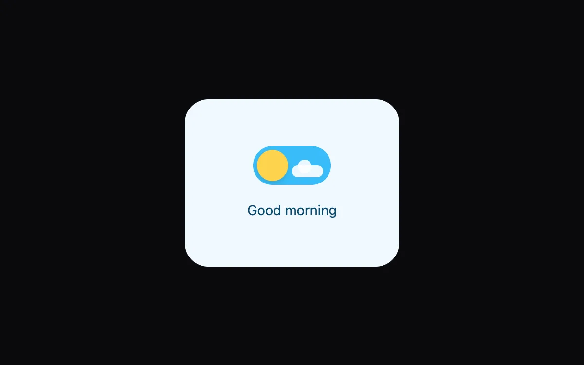
Open the live Day/Night Toggle preview.
About inputs components
Form controls decide whether people finish a sign-up or give up. These components keep native elements underneath, so labels, keyboard input, autofill and validation keep working, and the animation only adds feedback.
Install the Day/Night Toggle
- Create
components/ui/day-night-toggle.tsxin your React + Tailwind project. - Paste the code. It only imports React; keyframes are defined inside the file.
- Import the named component where you need it. The default export is a ready-made demo you can delete.
Frequently asked questions
Is the Day/Night Toggle component free?
Anyone can open the live preview. Copying the code is included with a Scrollhaus plan.
What do I need to use it?
A React project with Tailwind CSS: Next.js, Vite, Lovable or Bolt. The file only imports React; its animations ship inside the component.
Is it accessible?
It uses native elements and ARIA attributes where needed, keeps keyboard focus visible and works without a mouse.
More inputs
- OTP Input: One-time-code boxes with auto-advance, backspace, paste-to-fill and a success bounce.
- Floating Label Input: The label glides up on focus and the border lights from the centre.
- Combobox Search: A search field with suggestions, matched-text highlighting and full keyboard support.
- Password Strength: Show/hide toggle, a four-step strength meter and a live checklist of rules.
- Tag Input: Type and press Enter to add chips, Backspace to remove, with suggestions as you type.
- Range Slider: A filled track and a value bubble that follows the thumb, built on a real range input.