UI components / Inputs
Tag Input: a React and Tailwind UI component
Type and press Enter to add chips, Backspace to remove, with suggestions as you type.
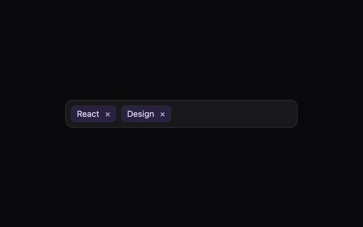
Open the live Tag Input preview.
About inputs components
Form controls decide whether people finish a sign-up or give up. These components keep native elements underneath, so labels, keyboard input, autofill and validation keep working, and the animation only adds feedback.
Install the Tag Input
- Create
components/ui/tag-input.tsxin your React + Tailwind project. - Paste the code. It only imports React; keyframes are defined inside the file.
- Import the named component where you need it. The default export is a ready-made demo you can delete.
Frequently asked questions
Is the Tag Input component free?
Anyone can open the live preview. Copying the code is included with a Scrollhaus plan.
What do I need to use it?
A React project with Tailwind CSS: Next.js, Vite, Lovable or Bolt. The file only imports React; its animations ship inside the component.
Is it accessible?
It uses native elements and ARIA attributes where needed, keeps keyboard focus visible and works without a mouse.
More inputs
- OTP Input: One-time-code boxes with auto-advance, backspace, paste-to-fill and a success bounce.
- Floating Label Input: The label glides up on focus and the border lights from the centre.
- Day/Night Toggle: A theme switch where the sun becomes a moon and stars fade in.
- Combobox Search: A search field with suggestions, matched-text highlighting and full keyboard support.
- Password Strength: Show/hide toggle, a four-step strength meter and a live checklist of rules.
- Range Slider: A filled track and a value bubble that follows the thumb, built on a real range input.