UI components / Feedback
Progress Ring: a React and Tailwind UI component
A circular progress indicator with a gradient stroke and an animated percentage.
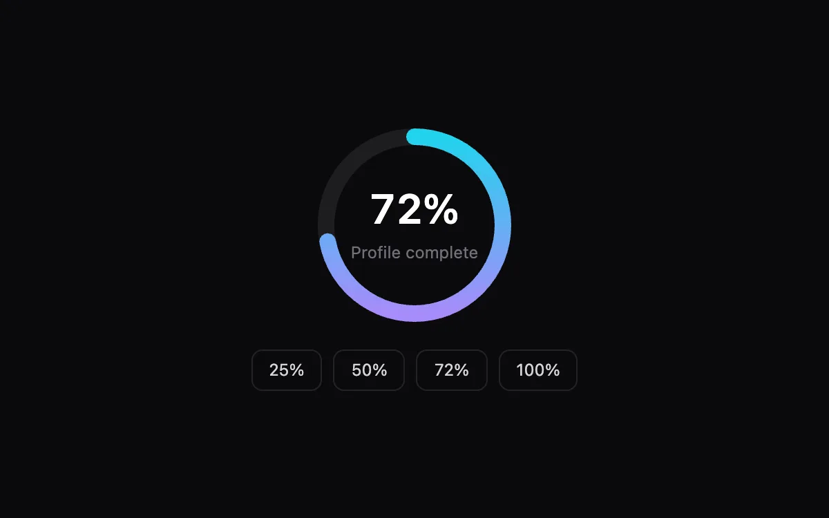
Open the live Progress Ring preview.
About feedback components
Feedback components tell people that something happened: a save, an upload, progress or an error. Pair every visual change with text a screen reader can announce, and keep timing short enough that nobody waits for an animation.
Install the Progress Ring
- Create
components/ui/progress-ring.tsxin your React + Tailwind project. - Paste the code. It only imports React; keyframes are defined inside the file.
- Import the named component where you need it. The default export is a ready-made demo you can delete.
Frequently asked questions
Is the Progress Ring component free?
Anyone can open the live preview. Copying the code is included with a Scrollhaus plan.
What do I need to use it?
A React project with Tailwind CSS: Next.js, Vite, Lovable or Bolt. The file only imports React; its animations ship inside the component.
Is it accessible?
It uses native elements and ARIA attributes where needed, keeps keyboard focus visible and works without a mouse.
More feedback
- Toast Stack: Notifications stack as fanned cards that expand on hover, auto-dismiss and swipe away.
- Avatar Stack: Overlapping avatars that spread apart on hover, with tooltips and a +N chip.
- Skeleton Loader: Shimmering placeholders that match the layout, then fade into the real content.
- Checklist: Checks that draw themselves, text that strikes through, and a progress bar for the list.
- Smart Tooltip: Appears after a short delay, flips below when there is no room above, and works on focus.