UI components / Feedback
Skeleton Loader: a React and Tailwind UI component
Shimmering placeholders that match the layout, then fade into the real content.
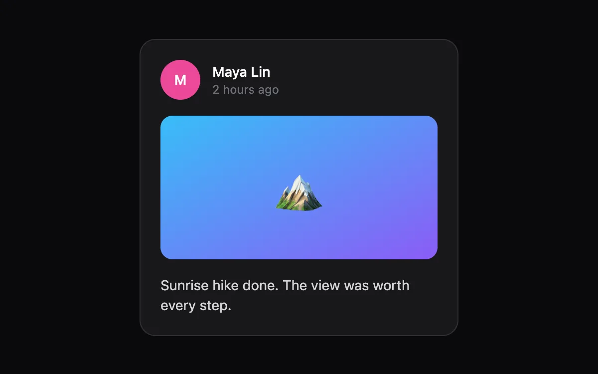
Open the live Skeleton Loader preview.
About feedback components
Feedback components tell people that something happened: a save, an upload, progress or an error. Pair every visual change with text a screen reader can announce, and keep timing short enough that nobody waits for an animation.
Install the Skeleton Loader
- Create
components/ui/skeleton-loader.tsxin your React + Tailwind project. - Paste the code. It only imports React; keyframes are defined inside the file.
- Import the named component where you need it. The default export is a ready-made demo you can delete.
Frequently asked questions
Is the Skeleton Loader component free?
Anyone can open the live preview. Copying the code is included with a Scrollhaus plan.
What do I need to use it?
A React project with Tailwind CSS: Next.js, Vite, Lovable or Bolt. The file only imports React; its animations ship inside the component.
Is it accessible?
It uses native elements and ARIA attributes where needed, keeps keyboard focus visible and works without a mouse.
More feedback
- Toast Stack: Notifications stack as fanned cards that expand on hover, auto-dismiss and swipe away.
- Avatar Stack: Overlapping avatars that spread apart on hover, with tooltips and a +N chip.
- Progress Ring: A circular progress indicator with a gradient stroke and an animated percentage.
- Checklist: Checks that draw themselves, text that strikes through, and a progress bar for the list.
- Smart Tooltip: Appears after a short delay, flips below when there is no room above, and works on focus.