Website Strategy · 2026-09-21 · 6 min read
One Page Website Examples: Layouts, Motion and Build Ideas
A strong one-page website makes one clear promise, then earns the next scroll. The best examples do not compress a whole company into a long brochure; they arrange the story, proof and action in an order a visitor can understand quickly.
Written and reviewed by Scrollhaus Editorial. Sources and methodology are documented in the article.
Key takeaways
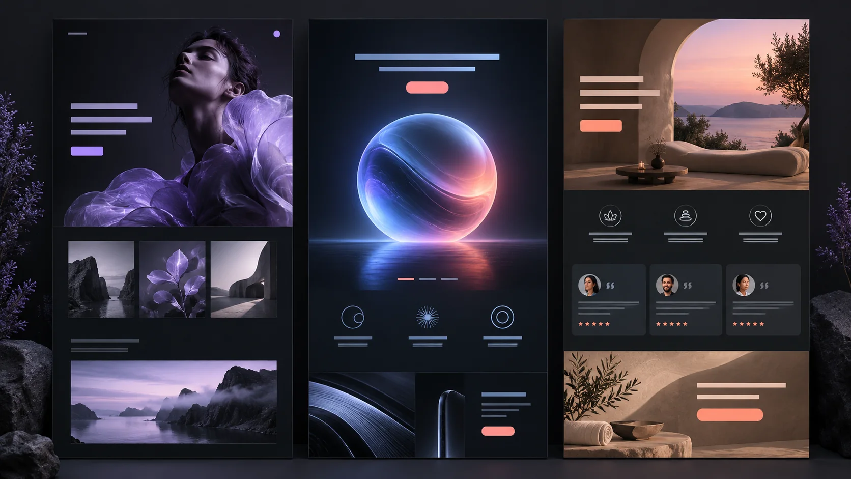
Quick answer: the most effective one-page website examples use a clear hero, one primary action, a logical sequence of proof and an easy way to reach the next section. A single page is useful when a visitor has one job to do: understand an offer, review a portfolio, join a waitlist or book a conversation.
Scrollhaus helps teams choose that direction before building. Browse a complete animated website preview, inspect how its sections and motion work together, then adapt the build into your own AI-assisted workflow.
What makes a one-page website work?
A one-page website has less room to hide an unclear idea. The page should answer five questions in sequence: what is this, who is it for, why should I believe it, what does it look or feel like, and what should I do next?
| Section | Job | Useful detail |
|---|---|---|
| Hero | State the promise and primary action | One focused headline, short support copy and one visible CTA |
| Context | Explain the problem or point of view | Use a visual or concise statement that makes the offer specific |
| Proof | Make the claim believable | Results, process, client work, product detail or a testimonial |
| Decision | Help a visitor choose | Features, pricing, comparison or a clear next step |
| Action | Finish the journey | Booking, checkout, sign-up or contact route with no ambiguity |
One-page portfolio website examples
A portfolio homepage should make the work easy to scan before it asks someone to read a biography. Start with a short statement of practice, show three to six representative projects, then give each project enough context to prove your role and result.
For a creative developer, motion can show taste and craft. Keep it purposeful: a restrained reveal, a responsive image treatment or a detail that reacts to the cursor can make a portfolio feel considered. It should never hide project names, prevent keyboard navigation or make a visitor wait for the work to load.
Use anchor links when the page has clear sections such as Work, Process and Contact. On mobile, make the navigation compact and keep the contact route visible. For more references, explore the template collection and the guide to animated website templates with source-oriented resources.
One-page product-launch examples
A product landing page earns attention by moving from outcome to mechanism. The hero introduces the result, the next section makes the product tangible, and later sections handle objections such as setup, price, compatibility or trust.
- Lead with the transformation. Describe what becomes easier or better for the customer before listing every feature.
- Show the interface or experience in context. Use meaningful screenshots, product footage or a demonstration, not decoration that looks like proof.
- Use motion to explain a change. A small transition can reveal a workflow or product state. Keep essential information available when reduced motion is enabled.
- Repeat the main action thoughtfully. The same CTA can appear after the hero, after proof and at the end of the page without becoming noisy.
The AI website design prompts guide shows how to describe this structure to a coding tool without relying on vague visual adjectives.
One-page service-business examples
A service website needs trust sooner than a portfolio or product launch. Put the audience and outcome in the hero, follow it with the offer, then show a credible process and a route to contact. Testimonials work best when they describe a specific experience or result rather than a generic compliment.
For a studio, consultant or agency, a simple conversion path often works well: introduction, selected work, services, process, proof, FAQ, consultation CTA. If the business serves separate audiences or has a large knowledge base, add supporting pages instead of forcing every answer into one scrolling page.
When to choose a one-page site or a multi-page site
Choose one page when one offer, one audience and one primary action define the visit. Choose a multi-page structure when visitors need to compare services, research detailed documentation, browse many products or arrive through different search intents.
One-page websites can rank, but they cannot answer every distinct search question well from one URL. A useful approach is a focused main landing page supported by articles, case studies, documentation or category pages. Scrollhaus follows that pattern: the collection is the main experience, while the Journal supports questions about templates, motion, AI workflows and production.
How to use animation without slowing the page
Motion should tell a visitor what changed, where they are or what to look at next. Favor ordinary browser scrolling and small transform or opacity transitions. Do not seek a video frame-by-frame on every scroll event. That technique commonly creates the choppy feeling visitors notice.
Test the page on a phone and a mid-range laptop. Make text readable before media starts, preserve the normal document order and offer a reduced-motion version. Our scroll animation websites guide and performance checklist explain the implementation trade-offs.
Build a one-page website from a complete direction
- Choose the page objective. Decide whether the visitor should view work, understand a product, book a call or join a list.
- Study a complete reference. Look at hierarchy, pacing, mobile behaviour and calls to action together, not as isolated screenshots.
- Write a structured build brief. Include audience, offer, sections, visual direction, responsive rules and animation constraints.
- Reproduce the structure before styling it. Establish the content flow, then adapt colours, typography, imagery and brand voice.
- Test the finished page. Review speed, keyboard use, contrast, mobile layout, forms and the final action.
Scrollhaus provides working references, live previews and build direction so teams can start with a clear decision instead of a blank prompt. Browse the website collection or choose a reusable creative prompt for a specific section.
Frequently asked questions
What should a one-page website include?
Include a clear headline, the primary offer, supporting proof, a logical section order and a visible call to action. Add navigation anchors when the page is long enough to need orientation.
Are one-page websites good for SEO?
They can rank for a focused topic when the content is useful and crawlable. Use supporting pages when the business needs to serve several distinct search intents or detailed topics.
How long should a one-page website be?
Long enough to answer a visitor’s questions and make the action feel justified. Remove sections that repeat the same claim or do not help a visitor decide.
Should a one-page site use scroll animation?
Only when motion supports hierarchy or explains a product. Keep scrolling normal, avoid long interaction traps and make the content usable without animation.
Methodology
This guide was planned using a NeuronWriter competitor analysis for “one page website examples,” completed on September 21, 2026. It identified One Page Love, Awwwards, Squarespace, Wix, A1 Gallery and Mobilo as relevant result types, with examples, layout guidance, navigation and implementation as recurring needs. The article excludes generic builder rankings, unsupported conversion claims and unrelated results. It adds original evaluation criteria, production constraints and internal references to Scrollhaus resources.
Need help choosing or adapting a direction? Email admin@scrollhaus.ai.
Explore animated website templates at Scrollhaus →
Need help with a template, account, or project? Email admin@scrollhaus.ai.