Ecommerce Website Guides · 2026-10-06 · 5 min read
Luxury Product Website Examples: Five Stories Built Around the Object
The strongest luxury product pages make the object the story. Explore five live Scrollhaus concepts and the design decisions that separate a compelling film from a usable product page.
Written by AmJ, founder of Scrollhaus, and edited by the Scrollhaus editorial team. Sources and methodology are documented in the article.
Key takeaways
Luxury product website examples are often collected as screenshots. A still can show art direction, but it cannot show whether the film is smooth, the product is legible or the purchase path is clear. The five working concepts below are meant to be opened and scrolled.
Publisher disclosure: Scrollhaus publishes these examples. FACET, AURELIS 88, STILL No. 8, CYMA One and NOX BOTANICA are fictional product demonstrations. Their specifications, prices, reservations and forms are illustrative until a builder replaces them and connects real services.
Five products, five reasons to move
| Live example | Product story | Useful motion decision |
|---|---|---|
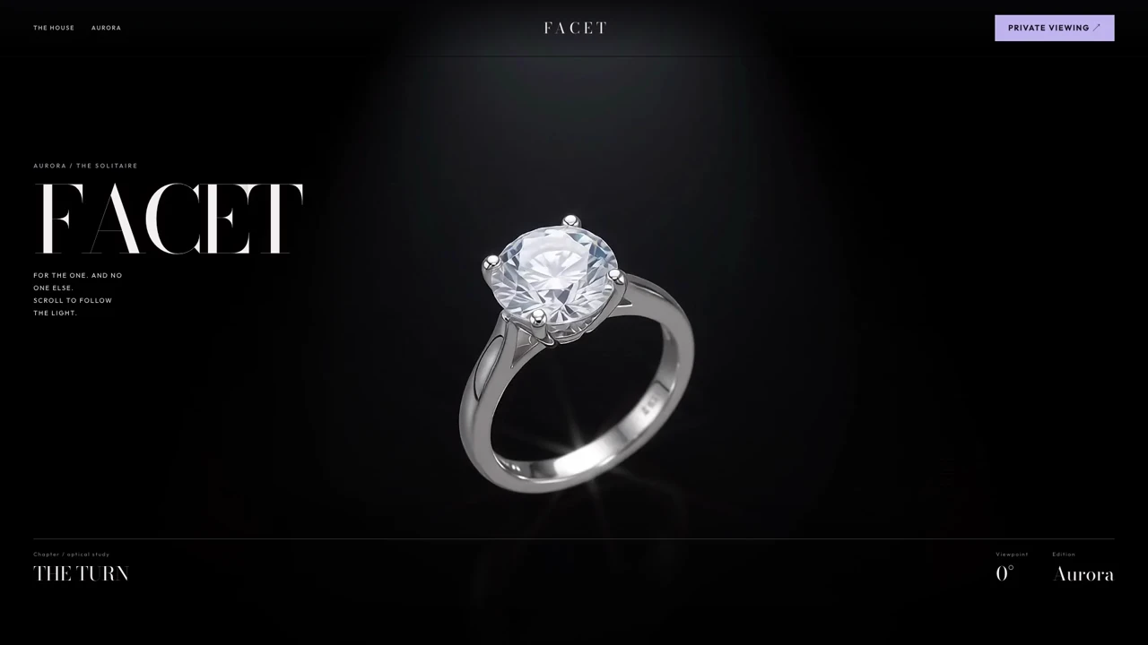
| FACET | An Aurora solitaire ring and the light returning through it | The turn, fire and interior detail each answer a different product question. |
| AURELIS 88 | A luxury watch described through time and movement | Scroll becomes a way to pace the reveal of an intricate object. |
| STILL No. 8 | An aged whisky and a suspended amber wave | Slowing one moment makes the product feel deliberate rather than busy. |
| CYMA One | A sculptural speaker visualized through colour and bass | The effect begins at the product, so spectacle explains an idea about sound. |
| NOX BOTANICA | A night serum told through an opening orchid | A botanical origin story gives the ingredient a visual role. |
Choose a motion device that makes the object easier to remember. A watch suggests measured timing. A ring suggests reflection. Whisky suggests patience. A speaker suggests energy. Skincare suggests transformation. Repeating the same spin or parallax on all five would flatten their differences.
How to judge a luxury product page
Start with a readable first frame
The hero needs to communicate brand and product before a visitor scrolls. Use a sharp poster or opening image, a concise headline and a visible cue that more follows. If the page waits for a long film before showing anything meaningful, the most expensive-looking animation may also create the weakest first impression.
Separate atmosphere from proof
A cinematic sequence can show finish, material and mood. Product proof belongs in a quieter section: dimensions, ingredients, movement, finish choices, care, shipping and return terms where applicable. Put the facts in text and controls that work without sound or motion. A simulated specification in a concept should be replaced with approved information before a real launch.
Make the action real
“Reserve”, “Book a viewing” and “Buy” are different promises. Connect the chosen action to your actual cart, appointment system or lead flow. If the concept contains a visual form only, say so during review and wire it up before publishing. The page should not imply that an order or enquiry was received when nothing was sent.
Material, typography and trust do as much work as animation
Luxury web design starts with the visual evidence of the object. For a ring, a close image of the setting can answer a question that a dramatic ray of light cannot. For a watch, show the movement and case in stable views. For skincare, show the bottle, formulation details and how to use it. Product photography needs consistent light, believable material and an image crop that still reads on a small screen.
Use type and spacing to set pace. A restrained headline, generous margins and a few precise details can feel more confident than a page full of animated labels. A minimalist layout does not mean missing information: the size, ingredients, warranty or delivery policy should be easy to locate. If a brand relies on craftsmanship, show the actual maker, process and evidence instead of repeating the word “premium”.
Trust signals must be real. Customer reviews need genuine customers; edition numbers need inventory to support them; care and returns language must match the business policy. This is the difference between a luxury design concept and a launch-ready ecommerce website. A shopper should understand the product and feel safe taking the next step.
When to use film, canvas frames or browser 3D
A looping background film works for ambience. A canvas image sequence works when scrolling must move through a specific filmed event in both directions. A browser-rendered 3D model is useful when people need free rotation or arbitrary views. The techniques have different loading, accessibility and asset requirements. A product film that looks three-dimensional is still a film, so inspect the actual build before promising interactive 3D.
For an exact scroll chapter, prepare a sharp initial frame and a sensible loading order. Keep text clear of the subject at desktop and phone widths. If the video already contains lettering, do not stack another headline over it. Provide a motion-reduced option and let the ordinary page continue after the cinematic moment. Our image-sequence guide explains the canvas route in detail.
From inspiration to a product you can sell
- Open two or three references on a phone and a laptop. Check the first frame, middle chapter, last frame and reverse scroll.
- List what the real product needs: images, variants, factual specifications, price, stock or availability, and policies.
- Choose the reference whose motion supports those facts. Ask for its available source and dependency list.
- Replace the fictional brand and media with approved material. Confirm rights for each image, video, font and package.
- Connect the real payment or enquiry service, then test a complete customer journey.
- Measure loading and responsiveness on the published site, including a fresh mobile visit.
The animated ecommerce guide compares broader product-story patterns. Read the licence checklist for client handoff and media questions. Our current plans explain the access period and what source is available; AI-builder credits, a domain and production hosting are separate.
What these examples can and cannot prove
They show design direction and working interactions. They do not prove a real product has the fictional specifications on screen, that a buyer can pay, or that the showcased media is licensed for your product. Treat the site as a starting point, then verify the real business details and the implementation on your own domain.
Frequently asked questions
What makes a luxury product website feel premium?
A clear product focus, deliberate pacing, strong material detail, readable typography and a simple route from discovery to product facts and action. Motion should support the object rather than obscure it.
Can I copy the live examples into an AI builder?
Scrollhaus provides build resources for eligible entries, but handoff formats vary. Inspect the entry’s source, dependencies and media rights, reproduce it first, then adapt the brand and product.
Do these examples include working checkout?
No. They are fictional design demonstrations. Real inventory, payment, bookings and form delivery must be connected to your services before publication.
Explore animated website templates at Scrollhaus →
Need help with a template, account, or project? Email admin@scrollhaus.ai.