AI Website Guides · 2026-10-02 · 14 min read
Lovable Animated Website Templates That Feel Built to Move
Learn how to choose, customize, test, and maintain lovable animated website templates with responsive motion, accessibility, and brand fit in mind.
Written and reviewed by Scrollhaus Editorial. Sources and methodology are documented in the article.

Key takeaways
Disclosure: ScrollHaus publishes this guide. ScrollHaus is a library of animated website templates with live previews and editable source, so it is one of the options in this space. Information about other products is based on their public websites and can change, so check the current details before you decide.
Lovable animated website templates can give a new site a sense of pace before a visitor reads a single sentence. A headline fades in. A project card tilts under a pointer. A product metric counts upward at the right moment. Used well, motion makes the interface feel guided rather than static.
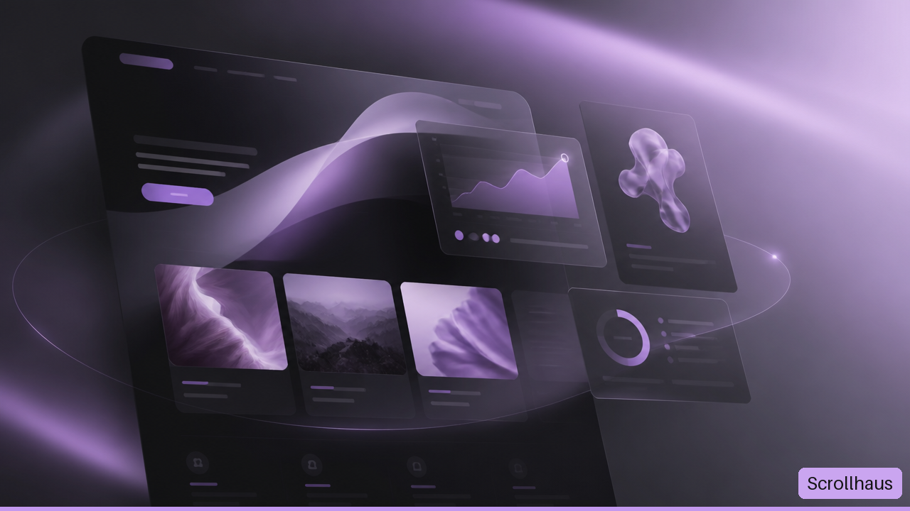
The key is not adding animation everywhere. I recommend choosing motion that supports a clear job: directing attention, explaining a product, showing personality, or making an interaction easier to understand. The most memorable sites move with intention. The most frustrating ones never stop moving.
Table Of Contents
• What Lovable Animated Website Templates Are
• How To Choose The Right Motion Style
• How To Customize And Test A Template
What Lovable Animated Website Templates Are
A Ready Made Site Structure With Motion Built In
Lovable animated website templates are prebuilt website foundations that pair page layouts with interaction patterns and visual motion. Instead of beginning with an empty canvas, you start with a working direction: sections, navigation, content blocks, responsive structure, and animation behavior that can be remixed for a new brand.
That distinction matters. A static wireframe may show where content belongs, but it cannot show timing, pacing, or what happens when a visitor scrolls. An animated template makes those decisions visible earlier. You can judge whether a hero feels calm, energetic, editorial, technical, playful, or too busy before spending time rebuilding the idea.
Lovable’s template catalog includes designs with parallax, animated statistics, and other animated website elements. Its broader website collection also lists animated templates across portfolios, research sites, audio pages, and fintech websites in its multi use case template catalog.
The template is the starting point, not the finished brand. It should provide a coherent system that you can reshape around your message, imagery, typography, and calls to action.
Decorative Motion Versus Useful Motion
Not every moving element does the same work. Before customizing a template, separate animation into two buckets: decorative motion and interaction critical motion.
| Motion Type | What It Does | Good Use | When To Avoid It |
|---|---|---|---|
| Decorative motion | Adds atmosphere or energy | Subtle background movement, image reveals, ambient shapes | When it competes with text or causes visual fatigue |
| Directional motion | Draws the eye toward an action | Button emphasis, a new section entering view, form progress | When every element asks for attention at once |
| Feedback motion | Confirms an action happened | Saved state, menu opening, card selection | When the same feedback can be clearer with copy or contrast |
| Explanatory motion | Shows how something works | Product demos, before and after states, data changes | When users need to pause, compare, or read closely |
A hover tilt on a portfolio card is usually decorative. A motion cue that shows which pricing plan is selected is functional. This is a practical test: if you remove the animation, can someone still complete the task without confusion? If yes, the motion is probably optional and should stay subtle. If no, it needs a visible static fallback.
Why Templates Help, And Where They Do Not
A template can reduce blank page friction. It can also keep a site visually consistent because spacing, buttons, type scale, and motion patterns are already related. That is useful for founders, marketers, creators, and small teams that need a polished first version without designing every component from scratch.
Still, a template cannot decide your brand strategy. A music site may look great with a kinetic waveform, while a legal service may need quiet transitions and clear reading states. Lovable’s Dark Band Portfolio template, for example, describes a 24 bar animated waveform, staggered card animations, and a mobile slide over navigation. Those patterns fit an audio focused identity. They would likely feel out of place on a site where visitors need to compare dense policy details.
Motion should make the next thing easier to notice. It should not make the current thing harder to understand.
How To Choose The Right Motion Style
Start With The Visitor’s Job
I suggest choosing animation after defining the page’s main job. A portfolio must make work easy to browse. A SaaS landing page must make value easy to grasp. An ecommerce page must help shoppers inspect products and move toward purchase. The animation style should follow that task.
Use this decision guide:
| Page Goal | Strong Motion Choice | Why It Fits | Watch For |
|---|---|---|---|
| Build a portfolio | Scroll reveals and restrained card hover states | They create a sequence without hiding the work | Hover cannot be the only way to reveal project details |
| Explain a product | Short product demos or Lottie illustrations | They can show a process faster than a paragraph | Avoid looping animations that distract from the message |
| Establish brand energy | Parallax, layered imagery, or kinetic type | They create depth and a distinct visual rhythm | Reduce or remove parallax on small screens if it feels unstable |
| Show social proof | Animated statistics or logo rows | They can help visitors scan credibility cues | Do not animate unsupported claims or make logos unreadable |
| Promote music or events | Waveforms, timed imagery, and bold transitions | They match the emotional tone of sound and performance | Keep controls, dates, and ticket links clear and still |
The Fintech Landing Page template description includes Lottie animations, animated statistics, scroll triggered animation, a testimonial carousel, and an infinite logo marquee. That is a useful example of a rich motion system, but it also creates a design question: which element gets priority?
For a financial product, the product value and primary action should win. If the carousel, number counters, and marquee all move within the same viewport, the visitor may not know where to look. Keep the strongest movement near the message that needs it most.
Build A Motion Budget
A motion budget is a practical limit on how much animation appears on one page at one time. It is not a formal universal standard. It is a way to stop a template from becoming a pileup of effects.
A reasonable starting budget for a marketing page might look like this:
• One hero motion moment, such as a layered image reveal or product demo
• One recurring entrance pattern for sections, such as a short fade and upward movement
• One interactive card or gallery behavior
• One optional ambient element, such as a slow background shape or logo row
• No more than one continuously moving element visible in a single screen area
This budget is deliberately conservative. Consider a landing page with an animated hero, counter, carousel, logo marquee, cursor effect, and floating gradient. Each effect might work in isolation. Together, they create competing rhythms and can consume attention before the visitor reaches the call to action.
Choose more motion when the website itself is a creative showcase, event, entertainment property, or experimental studio. Choose less when visitors need to read, compare, fill out a form, book an appointment, or complete a transaction. The best choice depends on the decision the page asks people to make.
Treat Mobile As A Different Interaction Environment
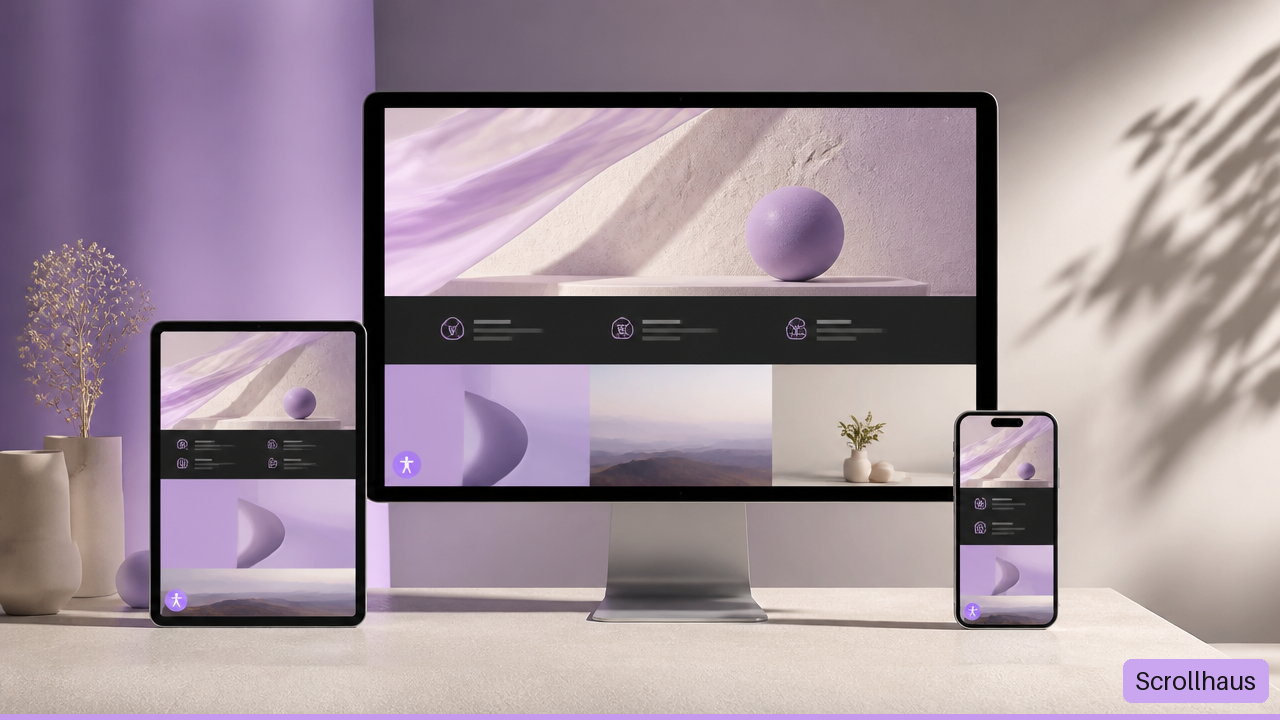
Responsive design is more than shrinking a desktop layout. Desktop users can hover. Touchscreen users tap, scroll, pinch, and often move through pages quickly. A hover only reveal may never appear on a phone. Deep parallax can feel jumpy during touch scrolling. Tiny animated text can become impossible to read.
Test each animation at desktop, tablet, and mobile sizes with a specific question in mind:
| Pattern | Desktop Behavior | Mobile Risk | Safer Mobile Treatment |
|---|---|---|---|
| Hover card | Pointer reveals detail or changes angle | No persistent hover state | Show essential details by default and keep tap feedback simple |
| Parallax hero | Layers move at different speeds | Scroll can feel heavy or disorienting | Reduce depth, slow the effect, or use a static image |
| Animated statistics | Numbers count upward on entry | Fast scrolling may skip the moment | Show the final value immediately or animate once only |
| Infinite marquee | Logos move continuously | Small logos become hard to scan | Increase spacing, slow movement, or pause offscreen |
| Lottie illustration | Plays a visual explanation | Large assets can delay a busy page | Use a simplified asset or a poster image fallback |
Responsive motion should preserve the message even when the effect is removed. That is the reliable rule.
How To Customize And Test A Template
Make The Brand System Yours First
Website customization works best when you edit in layers. Start with identity before chasing micro interactions. Otherwise, you can spend an hour refining a card tilt that no longer suits the new typography or color palette.
Replace placeholder copy and images. Use real headlines, real service descriptions, real product screens, and realistic content lengths. Placeholder text hides layout problems.
Set color and type roles. Choose a primary brand color, neutral surfaces, text colors, heading type, and body type. Check that text remains readable over moving imagery.
Update the content hierarchy. Decide what appears first, what earns a click, and what can wait. Remove sections that do not support the page goal.
Adjust motion intensity. Reduce duration, distance, scale, blur, and repeat behavior before adding new effects. Small edits can make a template feel far more branded.
Add only brand relevant assets. Replace a generic Lottie file with your own illustration only when it explains something meaningful or strengthens the visual identity.
For a portfolio example, an animated card could lift a few pixels and reveal the project type. That may fit a clean creative brand. A card that spins, blurs, changes color, and fires confetti probably does not. Premium often means controlled, not louder.
Lovable’s Sonder Designer Portfolio template describes scroll triggered project card animation and hover to straighten effects. That kind of interaction can support an editorial portfolio when the work remains readable without hovering.
Add Reduced Motion Support Before Publishing
Some visitors choose reduced motion settings because movement can be distracting or uncomfortable. A trustworthy animated website should respect that preference. The simplest approach is to make nonessential animation optional while keeping the content and functionality intact.
For a remixed template, audit reduced motion in this order:
Turn on a reduced motion setting in the device or browser environment.
Reload the page and check whether looping visuals, parallax, large entrance moves, and auto playing carousels become still or simpler.
Confirm that hidden content is visible without animation. A project description should not remain transparent because its entrance effect never runs.
Check focus states with keyboard navigation. Menus, buttons, dialogs, and forms need clear visual feedback even when motion is limited.
Test interactive controls without relying on drag, hover, or timing. A visitor should be able to use the site with taps, clicks, and keyboard input.
A useful fallback can be very plain: show the final statistic instead of counting to it; display the first carousel panel without autoplay; use a still hero image instead of parallax. The brand does not disappear when motion is reduced. The story simply becomes quieter.
Run A Practical Publish Audit
Animation can fail in ways that a static screenshot cannot reveal. A section might enter from the wrong direction after content changes. A carousel can trap keyboard focus. A large animation file can make the page feel slow on a weaker connection. These are implementation risks, not reasons to avoid animated templates altogether.
Before publishing, run this audit:
• Content: Remove placeholders, verify dates and prices, and check every button destination.
• Layout: Review narrow phones, wide phones, tablets, laptops, and large displays. Watch for cut off text, overlapping layers, and awkward empty space.
• Interaction: Test menus, forms, accordions, carousels, cards, and modal windows with mouse, touch, and keyboard.
• Motion: Confirm entrances run once when appropriate, loops have a purpose, and scrolling does not feel delayed.
• Fallbacks: Disable or limit motion and confirm all content remains visible and usable.
• Performance: Compress large imagery, remove unused embeds, and question every heavy animation asset. If a hero animation delays the message, simplify it.
• Measurement: Decide what success means before launch. It may be form completions, demo requests, completed purchases, time spent exploring work, or successful signups.
There is no dependable universal proof that animation alone improves conversion or retention. A polished transition may help people understand a page, or it may simply add decoration. For example, if a new animated hero increases time on page but demo requests decline, the effect may be attracting attention without improving the decision path. Compare the business action, not just the visual reaction.
Key Takeaways
Use Motion As A System, Not A Collection Of Tricks
• Choose lovable animated website templates based on the visitor’s task, not the most dramatic preview.
• Keep a motion budget so the hero, content, and call to action do not compete for attention.
• Treat responsive design as a behavior question: hover, parallax, carousels, and loops need different rules on touch devices.
• Customize brand identity before fine tuning animation. Real content exposes the layout issues that placeholders hide.
• Make reduced motion a first class requirement. Important content must remain visible and useful when animation is simplified or removed.
• Measure outcomes tied to the site’s goal. Motion is successful when it supports understanding and action, not merely when it looks impressive.
Frequently Asked Questions
What Are Lovable Animated Website Templates?
They are remixiable website starting points that combine layouts, visual styling, and animated interactions. They can include scroll reveals, hover states, animated statistics, Lottie illustrations, moving logo rows, or other motion patterns. The best template is the one whose structure and pacing fit your content with the least forced customization.
Can I Remix A Lovable Template Without Coding?
Yes, Lovable presents templates as remixiable foundations. You can change copy, colors, fonts, sections, images, and visual direction through its AI assisted building workflow. Complex changes may still require careful review because generated or edited code can introduce layout and animation regressions.
Which Animation Style Is Best For A Portfolio?
For most portfolios, use scroll triggered project reveals plus subtle hover feedback. These patterns guide visitors through work without making them wait. Choose parallax only when imagery is central to the story and the effect stays calm. Avoid making hover the only way to see a project title, role, or link because touch devices do not offer the same behavior.
Are Lovable Animations Responsive On Mobile Devices?
Template pages may describe responsive layouts, but every remix should be tested on actual mobile breakpoints. Responsive layout does not automatically mean every animation feels good on touchscreens. Simplify hover based features, reduce parallax, and ensure that key content is visible in its resting state.
How Do I Support Users Who Prefer Reduced Motion?
Keep the final content state available without animation, then limit nonessential movement when reduced motion is requested. Disable loops, replace large transitions with quick fades or no transition, stop autoplaying carousels, and show static values instead of counting effects. Test the result rather than assuming a template handles it automatically.
Do Animated Templates Slow Down A Website?
They can, especially when a page combines large videos, heavy images, several third party embeds, and complex animation files. The impact depends on the assets and implementation. Start by removing unnecessary motion, compressing media, and using static fallbacks for large visual elements. A simpler animation that loads quickly is usually better than a spectacular one that delays the page.
Can Animation Improve Conversions?
It can help when it clarifies a product, focuses attention on a next step, or makes an interface easier to understand. It can also hurt when it delays content, distracts from forms, or makes visitors work to find key information. Track the action that matters, such as purchases or inquiries, and compare performance after meaningful changes.
Sources
• Lovable — Website Templates for AI-Powered Apps and Sites
• Lovable — Fintech Landing Page Template
• Lovable — Sonder Designer Portfolio Template
• Lovable — Dark Band Portfolio Template
Where ScrollHaus fits
ScrollHaus gives Lovable users a working animated reference first, then the source and prompt to continue from. Keep the build as one document so the scroll motion survives.
- Browse the ScrollHaus library of animated website templates
- Try the free templates on GitHub
- AI website prompts for Lovable, Bolt and Claude
- Animated website templates for client projects
Explore animated website templates at Scrollhaus →
Need help with a template, account, or project? Email admin@scrollhaus.ai.